"use client";

import {
  useCallback,
  useEffect,
  useId,
  useLayoutEffect,
  useRef,
  useState,
  type CSSProperties,
  type KeyboardEvent,
  type ReactNode,
} from "react";
import {
  AnimatePresence,
  MotionConfig,
  animate,
  motion,
  useIsPresent,
  useReducedMotion,
} from "motion/react";

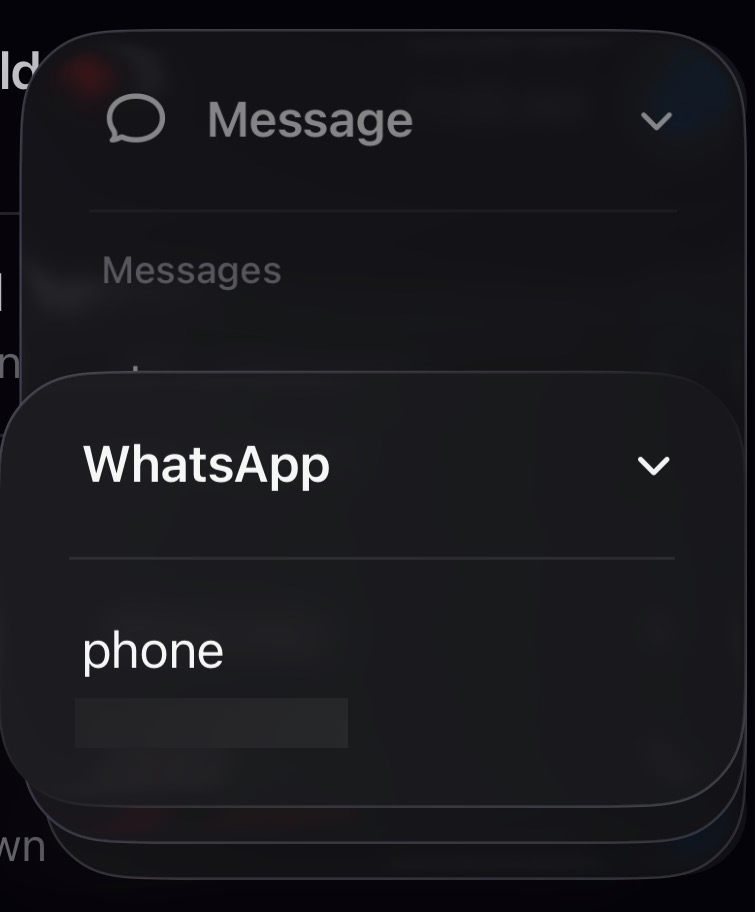
// Unlimited nested menu - iOS-style stacked drill-down.
//
// The main dropdown never changes. Click a branch item and its children open as
// a NEW panel anchored right under that item, laid OVER the menu below it - the
// clicked item's name becomes the new panel's title (its header sits exactly
// where the item was, so the row appears to turn into the title). Do it again
// and the grandchildren stack the same way. There is no depth limit; parents
// stay visible and dimmed behind, and clicking one pops back to it.
//
// Motion (motion/react):
//   - Opening the MENU: the root panel reveals from the trigger, scale + fade.
//   - Drilling a branch: a shared-element morph - the child panel mounts clipped
//     to just its header, which sits EXACTLY where the clicked row is and keeps
//     the row's own icon, then opens - the clip expands downward while the
//     title's weight crossfades plain -> bold (a measured, imperative animate()
//     sequence, since the morph targets depend on the clicked row's geometry).
//   - Any close (pop a level, or close the whole menu): AnimatePresence fades
//     the leaving panel (or the whole stack) in place - shorter than the enter,
//     no drift - with none of the exit-snapshot bookkeeping.
//
// Positioning is JS-measured against the popup origin, with a viewport-edge
// correction (--nm-shift-x) so a full-width panel near the screen edge slides to
// stay on-screen. Requires the lab-theme tokens. Fully Tailwind, no CSS files.

const EASE = [0.22, 1, 0.36, 1] as const;
const POP_S = 0.22; // per-panel enter
const EXIT_S = 0.15; // exits are quicker + quieter than the enter

// Panel shadows: the front panel owns the stack's elevation; panels behind it
// collapse to a crisp hairline so shadows don't compound with depth.
const SHADOW_ELEV =
  "shadow-[0_0_0_1px_rgba(0,0,0,0.07),0_14px_34px_-10px_rgba(0,0,0,0.26),0_5px_14px_-6px_rgba(0,0,0,0.12)]";
const SHADOW_BEHIND = "shadow-[0_0_0_1px_rgba(0,0,0,0.05),0_1px_2px_-1px_rgba(0,0,0,0.08)]";

export interface NestedMenuItem {
  id?: string;
  label: string;
  icon?: ReactNode;
  hint?: string;
  danger?: boolean;
  disabled?: boolean;
  items?: NestedMenuItem[];
}

export interface NestedMenuState {
  open: boolean;
  depth: number;
  title: string;
  path: string[];
  count: number;
  lastPick: string | null;
}

interface Frame {
  node: NestedMenuItem | null;
  fromIndex: number | null;
  anchor: { top: number; left: number };
  morph?: { labelX: number; labelCY: number } | null;
}

export default function NestedMenu({
  items,
  rootTitle = "Actions",
  triggerLabel = "Open menu",
  dim = true,
  animate: animateProp = true,
  align = "start",
  open: controlledOpen,
  defaultOpen = false,
  onOpenChange,
  onSelect,
  onStateChange,
  inspect = false,
  className = "",
}: {
  items: NestedMenuItem[];
  rootTitle?: string;
  triggerLabel?: string;
  dim?: boolean;
  animate?: boolean;
  align?: "start" | "end";
  open?: boolean;
  defaultOpen?: boolean;
  onOpenChange?: (open: boolean) => void;
  onSelect?: (item: NestedMenuItem, path: string[]) => void;
  onStateChange?: (state: NestedMenuState) => void;
  inspect?: boolean;
  className?: string;
}) {
  const [openU, setOpenU] = useState(defaultOpen);
  const open = controlledOpen ?? openU;
  const setOpen = useCallback(
    (value: boolean) => {
      if (controlledOpen === undefined) setOpenU(value);
      onOpenChange?.(value);
    },
    [controlledOpen, onOpenChange],
  );

  const [frames, setFrames] = useState<Frame[]>([{ node: null, fromIndex: null, anchor: { top: 0, left: 0 } }]);
  const [activeIndex, setActiveIndex] = useState(0);
  const [lastPick, setLastPick] = useState<string | null>(null);

  const top = frames[frames.length - 1];
  const topItems = top.node ? top.node.items ?? [] : items;
  const depth = frames.length - 1;
  const path = frames.slice(1).map((f) => f.node!.label);

  const rootRef = useRef<HTMLDivElement>(null);
  const triggerRef = useRef<HTMLButtonElement>(null);
  const stackRef = useRef<HTMLDivElement>(null);
  const itemRefs = useRef<(HTMLButtonElement | null)[]>([]);
  const pendingFocus = useRef<number | null>(null);
  const inspectDrilled = useRef(false);
  itemRefs.current = [];

  const popupId = useId();

  const resetToRoot = useCallback(() => {
    setFrames([{ node: null, fromIndex: null, anchor: { top: 0, left: 0 } }]);
    setActiveIndex(0);
  }, []);

  const openMenu = useCallback(() => {
    resetToRoot();
    pendingFocus.current = 0;
    setOpen(true);
  }, [resetToRoot, setOpen]);

  // Close is logical-immediate (open -> false, focus returns now); Animate-
  // Presence keeps the popup mounted a beat so the whole stack fades out.
  const closeMenu = useCallback(
    (returnFocus: boolean) => {
      setOpen(false);
      if (returnFocus) requestAnimationFrame(() => triggerRef.current?.focus());
    },
    [setOpen],
  );

  // Open a branch: measure the clicked item so the child lands right under it,
  // and where its label sits so the child's title can morph out of the row.
  const drill = useCallback((item: NestedMenuItem, index: number, el?: HTMLElement | null) => {
    if (!item.items?.length) return;
    const origin = stackRef.current;
    const node = el ?? itemRefs.current[index];
    let anchor = { top: 0, left: 0 };
    let morph: { labelX: number; labelCY: number } | null = null;
    if (origin && node) {
      const o = origin.getBoundingClientRect();
      const r = node.getBoundingClientRect();
      // Left: the PARENT panel's left so the stack is a clean vertical staircase.
      const panelEl = node.closest("[data-nm-panel]");
      const left = panelEl ? panelEl.getBoundingClientRect().left - o.left : 0;
      anchor = { top: r.top - o.top, left };
      const labelEl = (node.querySelector("[data-nm-label]") ?? node) as HTMLElement;
      const lr = labelEl.getBoundingClientRect();
      morph = {
        labelX: lr.left - (o.left + anchor.left),
        labelCY: lr.top + lr.height / 2 - (o.top + anchor.top),
      };
    }
    setFrames((f) => [...f, { node: item, fromIndex: index, anchor, morph }]);
    setActiveIndex(0);
    pendingFocus.current = 0;
  }, []);

  // Pop back to a given depth (default: one level). AnimatePresence fades the
  // removed panel out on its own - no exit snapshot to manage.
  const popTo = useCallback(
    (target = depth - 1) => {
      if (target < 0 || target >= depth) return;
      const removed = frames[frames.length - 1];
      setFrames((f) => f.slice(0, target + 1));
      const restore = target === depth - 1 ? removed.fromIndex ?? 0 : 0;
      setActiveIndex(restore);
      pendingFocus.current = restore;
    },
    [depth, frames],
  );

  const select = useCallback(
    (item: NestedMenuItem) => {
      if (item.disabled) return;
      setLastPick(item.label);
      onSelect?.(item, path);
      closeMenu(true);
    },
    [closeMenu, onSelect, path],
  );

  const focusIndex = useCallback((index: number) => {
    setActiveIndex(index);
    itemRefs.current[index]?.focus();
  }, []);

  const nextEnabled = useCallback(
    (from: number, delta: number) => {
      const n = topItems.length;
      for (let step = 1; step <= n; step += 1) {
        const i = (from + delta * step + n * step) % n;
        if (!topItems[i]?.disabled) return i;
      }
      return from;
    },
    [topItems],
  );

  useLayoutEffect(() => {
    if (!open) return;
    if (pendingFocus.current != null) {
      const i = pendingFocus.current;
      pendingFocus.current = null;
      requestAnimationFrame(() => itemRefs.current[i]?.focus());
    }
  }, [open, frames.length]);

  useEffect(() => {
    if (!inspect) {
      inspectDrilled.current = false;
      return;
    }
    openMenu();
    // eslint-disable-next-line react-hooks/exhaustive-deps
  }, [inspect]);
  useEffect(() => {
    if (!inspect || !open || depth > 0 || inspectDrilled.current) return;
    inspectDrilled.current = true;
    const id = window.setTimeout(() => {
      const first = topItems[0];
      if (first?.items?.length) drill(first, 0, itemRefs.current[0]);
    }, 60);
    return () => clearTimeout(id);
  }, [inspect, open, depth, topItems, drill]);

  useEffect(() => {
    if (!open) return undefined;
    const onDown = (e: PointerEvent) => {
      if (!rootRef.current?.contains(e.target as Node)) closeMenu(false);
    };
    document.addEventListener("pointerdown", onDown);
    return () => document.removeEventListener("pointerdown", onDown);
  }, [open, closeMenu]);

  // Keep the whole stack inside the viewport horizontally: shift the ORIGIN (not
  // each panel) so the staircase slides together and the drill math stays intact.
  useLayoutEffect(() => {
    if (!open) return undefined;
    const el = stackRef.current;
    if (!el) return undefined;
    const GUTTER = 8;
    let raf = 0;
    const place = () => {
      raf = 0;
      el.style.setProperty("--nm-shift-x", "0px");
      const rect = el.getBoundingClientRect();
      const vw = document.documentElement.clientWidth;
      let shift = 0;
      const overRight = rect.right - (vw - GUTTER);
      if (overRight > 0) shift = -overRight;
      if (rect.left + shift < GUTTER) shift = GUTTER - rect.left;
      el.style.setProperty("--nm-shift-x", `${Math.round(shift)}px`);
    };
    const schedule = () => {
      if (!raf) raf = requestAnimationFrame(place);
    };
    place();
    window.addEventListener("resize", schedule);
    window.addEventListener("scroll", schedule, true);
    return () => {
      if (raf) cancelAnimationFrame(raf);
      window.removeEventListener("resize", schedule);
      window.removeEventListener("scroll", schedule, true);
    };
  }, [open]);

  useEffect(() => {
    onStateChange?.({
      open,
      depth,
      title: top.node ? top.node.label : rootTitle,
      path,
      count: topItems.length,
      lastPick,
    });
    // eslint-disable-next-line react-hooks/exhaustive-deps
  }, [open, depth, topItems, lastPick]);

  function onKeyDown(e: KeyboardEvent<HTMLDivElement>) {
    const item = topItems[activeIndex];
    switch (e.key) {
      case "ArrowDown":
        e.preventDefault();
        focusIndex(nextEnabled(activeIndex, 1));
        break;
      case "ArrowUp":
        e.preventDefault();
        focusIndex(nextEnabled(activeIndex, -1));
        break;
      case "Home":
        e.preventDefault();
        focusIndex(nextEnabled(-1, 1));
        break;
      case "End":
        e.preventDefault();
        focusIndex(nextEnabled(0, -1));
        break;
      case "ArrowRight":
        if (item?.items?.length) {
          e.preventDefault();
          drill(item, activeIndex, itemRefs.current[activeIndex]);
        }
        break;
      case "Enter":
      case " ":
        e.preventDefault();
        if (item?.items?.length) drill(item, activeIndex, itemRefs.current[activeIndex]);
        else if (item) select(item);
        break;
      case "ArrowLeft":
      case "Backspace":
        if (depth > 0) {
          e.preventDefault();
          popTo(depth - 1);
        }
        break;
      case "Escape":
        e.preventDefault();
        if (depth > 0) popTo(depth - 1);
        else closeMenu(true);
        break;
      case "Tab":
        closeMenu(false);
        break;
      default:
        break;
    }
  }

  return (
    <MotionConfig reducedMotion="user">
      <div
        ref={rootRef}
        className={`group/nm relative inline-block ${className}`}
        data-open={open ? "true" : "false"}
      >
        <button
          ref={triggerRef}
          type="button"
          className="inline-flex items-center gap-2 rounded-[0.625rem] bg-card px-3 py-2 text-sm font-medium text-foreground shadow-border [transition:box-shadow_250ms_var(--ease-smooth-out)] hover:shadow-border-hover focus-visible:outline-2 focus-visible:outline-offset-2 focus-visible:outline-ring [&>svg]:text-muted-foreground"
          aria-haspopup="menu"
          aria-expanded={open}
          aria-controls={popupId}
          onClick={() => (open ? closeMenu(true) : openMenu())}
        >
          <MenuIcon />
          <span>{triggerLabel}</span>
          <motion.span
            className="inline-flex text-muted-foreground/70"
            animate={{ rotate: open ? 180 : 0 }}
            transition={{ duration: 0.25, ease: EASE }}
          >
            <ChevronDownIcon />
          </motion.span>
        </button>

        <AnimatePresence>
          {open && (
            <motion.div
              key="popup"
              id={popupId}
              ref={stackRef}
              initial={false}
              exit={{ opacity: 0, pointerEvents: "none" }}
              transition={{ duration: animateProp ? EXIT_S : 0, ease: EASE }}
              className={`absolute top-[calc(100%+0.375rem)] z-40 w-[17rem] [transform:translateX(var(--nm-shift-x,0px))] ${
                align === "end" ? "right-0" : "left-0"
              }`}
              data-align={align}
            >
              <AnimatePresence>
                {frames.map((frame, d) => {
                  const isTop = d === frames.length - 1;
                  const title = frame.node ? frame.node.label : rootTitle;
                  const panelItems = frame.node ? frame.node.items ?? [] : items;
                  return (
                    <Panel
                      key={frame.node?.id ?? frame.node?.label ?? "root"}
                      depth={d}
                      title={title}
                      items={panelItems}
                      anchor={frame.anchor}
                      morphFrom={frame.morph}
                      nodeIcon={frame.node?.icon}
                      isTop={isTop}
                      dim={dim}
                      animate={animateProp}
                      activeIndex={isTop ? activeIndex : -1}
                      itemRefs={isTop ? itemRefs : null}
                      onItemEnter={isTop ? (i) => { if (!panelItems[i].disabled) setActiveIndex(i); } : undefined}
                      onItemActivate={
                        isTop
                          ? (item, i, el) =>
                              item.disabled ? undefined : item.items?.length ? drill(item, i, el) : select(item)
                          : undefined
                      }
                      onBehindClick={!isTop ? () => popTo(d) : undefined}
                      onBack={isTop && d > 0 ? () => popTo(d - 1) : undefined}
                      onKeyDown={isTop ? onKeyDown : undefined}
                      inspect={inspect}
                    />
                  );
                })}
              </AnimatePresence>
            </motion.div>
          )}
        </AnimatePresence>
      </div>
    </MotionConfig>
  );
}

function Panel({
  depth,
  title,
  items,
  anchor,
  morphFrom,
  nodeIcon,
  isTop,
  dim,
  animate: animateProp,
  activeIndex,
  itemRefs,
  onItemEnter,
  onItemActivate,
  onBack,
  onBehindClick,
  onKeyDown,
  inspect,
}: {
  depth: number;
  title: string;
  items: NestedMenuItem[];
  anchor: { top: number; left: number };
  morphFrom?: { labelX: number; labelCY: number } | null;
  nodeIcon?: ReactNode;
  isTop: boolean;
  dim: boolean;
  animate: boolean;
  activeIndex: number;
  itemRefs: React.MutableRefObject<(HTMLButtonElement | null)[]> | null;
  onItemEnter?: (index: number) => void;
  onItemActivate?: (item: NestedMenuItem, index: number, el: HTMLElement) => void;
  onBack?: () => void;
  onBehindClick?: () => void;
  onKeyDown?: (e: KeyboardEvent<HTMLDivElement>) => void;
  inspect?: boolean;
}) {
  const panelRef = useRef<HTMLDivElement>(null);
  const reduced = useReducedMotion();
  // False while AnimatePresence fades this panel out after a pop - it is a
  // frozen snapshot then: no pointer events, hidden from the tree.
  const present = useIsPresent();

  // The shared-element morph. The targets depend on the clicked row's measured
  // geometry, so this is an imperative motion animate() pass, run once before
  // first paint: the panel opens out of the row (clip expands downward), the
  // title glides from the row label's seat while its weight crossfades
  // plain -> bold, and the list + divider fade in under it.
  useLayoutEffect(() => {
    const el = panelRef.current;
    if (!el || !animateProp || !morphFrom || reduced) return;
    const titleEl = el.querySelector<HTMLElement>("[data-nm-title]");
    const headEl = el.querySelector<HTMLElement>("[data-nm-header]");
    const plainEl = el.querySelector<HTMLElement>("[data-nm-title-plain]");
    const boldEl = el.querySelector<HTMLElement>("[data-nm-title-bold]");
    const listEl = el.querySelector<HTMLElement>("[data-nm-list]");
    if (!titleEl || !headEl) return;
    const p = el.getBoundingClientRect();
    const t = titleEl.getBoundingClientRect();
    const dx = morphFrom.labelX - (t.left - p.left);
    const dy = morphFrom.labelCY - (t.top + t.height / 2 - p.top);
    const clip = Math.max(0, p.height - headEl.getBoundingClientRect().height);
    const opts = { duration: POP_S, ease: EASE } as const;
    // -48px (not 0): a clip-path clips the element's OWN box-shadow, and
    // inset(0) sits exactly on the border box - it would slice the ring off.
    animate(
      el,
      { clipPath: [`inset(0px 0px ${clip}px 0px round 12px)`, "inset(-48px -48px -48px -48px round 12px)"] },
      opts,
    );
    animate(titleEl, { x: [dx, 0], y: [dy, 0] }, opts);
    if (plainEl) animate(plainEl, { opacity: [1, 0] }, opts);
    if (boldEl) animate(boldEl, { opacity: [0, 1] }, opts);
    if (listEl) animate(listEl, { opacity: [0, 1] }, opts);
    animate(headEl, { borderBottomColor: ["rgba(0,0,0,0)", "rgba(0,0,0,0.06)"] }, opts);
    // eslint-disable-next-line react-hooks/exhaustive-deps
  }, []);

  const shadowClass = inspect
    ? isTop
      ? "shadow-none outline outline-[1.5px] outline-dashed outline-[#ef4444]"
      : "shadow-none outline outline-[1.5px] outline-dashed outline-[#3b82f6]"
    : isTop
      ? SHADOW_ELEV
      : `${SHADOW_BEHIND} cursor-pointer`;

  const positionStyle: CSSProperties =
    depth === 0
      ? { position: "relative", zIndex: 10 }
      : { top: `${anchor.top}px`, left: `${anchor.left}px`, zIndex: 10 + depth };

  // Enter treatment: the root reveals from the trigger; a measured sub-panel
  // morphs (imperative, above); an unmeasured sub-panel pops in as a fallback.
  const enterProps = !animateProp
    ? { initial: false as const }
    : morphFrom
      ? { initial: false as const }
      : depth === 0
        ? {
            initial: { opacity: 0, scale: 0.96, y: -4 },
            animate: { opacity: 1, scale: 1, y: 0 },
          }
        : {
            initial: { opacity: 0, scale: 0.95, y: -6 },
            animate: { opacity: 1, scale: 1, y: 0 },
          };

  return (
    <motion.div
      ref={panelRef}
      data-nm-panel
      {...enterProps}
      exit={{ opacity: 0 }}
      transition={{ duration: animateProp ? POP_S : 0, ease: EASE, opacity: { duration: animateProp ? EXIT_S : 0, ease: EASE } }}
      className={[
        "absolute w-[17rem] origin-top rounded-xl bg-popover",
        "[transition:box-shadow_220ms_var(--ease-smooth-out)]",
        shadowClass,
      ].join(" ")}
      data-active={isTop ? "true" : "false"}
      style={{ ...positionStyle, pointerEvents: present ? undefined : "none" }}
      onClick={onBehindClick}
      aria-hidden={present && isTop ? undefined : "true"}
    >
      {/* Opaque panel + veil scrim so stacked layers dim without bleeding
          through (panel opacity would reveal every layer behind). */}
      {!isTop && present && (
        <motion.span
          className="absolute inset-0 z-[5] rounded-[inherit] bg-popover pointer-events-none"
          initial={{ opacity: 0 }}
          animate={{ opacity: dim ? 0.62 : 0 }}
          transition={{ duration: animateProp ? POP_S : 0, ease: EASE }}
          aria-hidden="true"
        />
      )}

      {/* Sub headers mirror an item row's geometry exactly AND keep the item's
          own icon, so the morph's start frame IS the clicked row - the only
          thing that changes as it becomes the title is the label's weight.
          The icon doubles as the back button. */}
      <div
        data-nm-header
        className={[
          "flex items-center border-b border-foreground/[0.06]",
          depth > 0 ? "min-h-9 gap-2.5 px-[0.875rem]" : "min-h-10 gap-1.5 py-1 pr-2 pl-[0.875rem]",
          inspect && depth > 0 ? "outline outline-[1.5px] outline-dashed outline-[#f59e0b] -outline-offset-[1.5px]" : "",
        ].join(" ")}
      >
        {depth > 0 &&
          (onBack ? (
            <button
              type="button"
              className="relative inline-flex h-4 w-4 flex-none cursor-pointer items-center justify-center text-muted-foreground hover:text-foreground before:absolute before:-inset-1.5 before:rounded-lg before:content-[''] before:[transition:background-color_250ms_var(--ease-smooth-out)] hover:before:bg-accent [&>svg]:relative"
              tabIndex={-1}
              onMouseDown={(e) => e.preventDefault()}
              onClick={(e) => {
                e.stopPropagation();
                onBack();
              }}
              aria-label="Back"
            >
              {nodeIcon ?? <ChevronLeftIcon />}
            </button>
          ) : (
            <span
              className="relative inline-flex h-4 w-4 flex-none items-center justify-center text-muted-foreground [&>svg]:relative"
              aria-hidden="true"
            >
              {nodeIcon ?? <ChevronLeftIcon />}
            </span>
          ))}
        <span
          data-nm-title
          className="relative min-w-0 flex-1 overflow-hidden text-ellipsis whitespace-nowrap text-sm text-foreground"
        >
          {/* Two stacked copies: the bold one is the real header text, the plain
              one matches the row label. The morph crossfades them - smoother
              than animating font-weight, which steps without a variable font. */}
          <span data-nm-title-plain className="absolute inset-0 font-normal opacity-0 pointer-events-none" aria-hidden="true">
            {title}
          </span>
          <span data-nm-title-bold className="font-semibold tracking-[-0.006em]">
            {title}
          </span>
        </span>
      </div>

      <div
        data-nm-list
        className="flex max-h-[18rem] flex-col gap-px overflow-y-auto overscroll-contain p-1.5"
        role={isTop && present ? "menu" : undefined}
        aria-label={isTop && present ? title : undefined}
        onKeyDown={onKeyDown}
      >
        {items.map((item, index) => {
          const branch = (item.items?.length ?? 0) > 0;
          const active = isTop && present && index === activeIndex;
          const rowClass = [
            "group/item flex w-full min-h-9 items-center gap-2.5 rounded-lg px-2 text-left text-sm text-foreground [transition:background-color_250ms_var(--ease-smooth-out)]",
            "hover:bg-accent focus-visible:outline-2 focus-visible:-outline-offset-2 focus-visible:outline-ring",
            "aria-disabled:text-muted-foreground/70 aria-disabled:cursor-default aria-disabled:hover:bg-transparent",
            "data-[danger=true]:text-destructive data-[danger=true]:hover:bg-destructive/10 data-[danger=true]:data-[highlighted=true]:bg-destructive/10",
            active ? "bg-accent" : "",
            "[@media(pointer:coarse)]:min-h-11",
          ].join(" ");
          const inner = (
            <>
              {item.icon && (
                <span className="inline-flex flex-none text-muted-foreground group-data-[danger=true]/item:text-destructive group-aria-[disabled=true]/item:text-muted-foreground/50">
                  {item.icon}
                </span>
              )}
              <span data-nm-label className="min-w-0 flex-1 overflow-hidden text-ellipsis whitespace-nowrap">
                {item.label}
              </span>
              {branch ? (
                <span className="inline-flex flex-none text-muted-foreground" aria-hidden="true">
                  <ChevronRightIcon />
                </span>
              ) : item.hint ? (
                <span className="flex-none text-xs tabular-nums text-muted-foreground">{item.hint}</span>
              ) : null}
            </>
          );
          if (!isTop || !present) {
            return (
              <div key={item.id ?? item.label ?? index} className={rowClass} data-danger={item.danger ? "true" : undefined}>
                {inner}
              </div>
            );
          }
          return (
            <button
              key={item.id ?? item.label ?? index}
              ref={(el) => {
                if (itemRefs) itemRefs.current[index] = el;
              }}
              type="button"
              role="menuitem"
              className={rowClass}
              data-highlighted={active ? "true" : undefined}
              data-danger={item.danger ? "true" : undefined}
              aria-haspopup={branch ? "menu" : undefined}
              aria-expanded={branch ? false : undefined}
              aria-disabled={item.disabled ? "true" : undefined}
              tabIndex={active ? 0 : -1}
              onClick={(e) => {
                e.stopPropagation();
                onItemActivate?.(item, index, e.currentTarget);
              }}
              onMouseEnter={() => onItemEnter?.(index)}
            >
              {inner}
            </button>
          );
        })}
        {items.length === 0 && <p className="px-2 py-3 text-[0.8125rem] text-muted-foreground">Nothing here yet</p>}
      </div>

      {inspect && isTop && present && (
        <span
          className={`absolute left-0 top-[calc(100%+0.3rem)] z-[7] whitespace-nowrap rounded-[0.25rem] bg-white px-[0.3125rem] py-[0.0625rem] text-[0.625rem] font-medium leading-normal shadow-[0_1px_2px_rgba(0,0,0,0.08)] pointer-events-none ${
            depth > 0 ? "border border-[#fecaca] text-[#dc2626]" : "border border-[#bfdbfe] text-[#2563eb]"
          }`}
        >
          {depth > 0 ? "opens under the item · its name is the title" : "click a › to stack a panel over this one"}
        </span>
      )}
    </motion.div>
  );
}

function Svg({ children, size = 16 }: { children: ReactNode; size?: number }) {
  return (
    <svg width={size} height={size} viewBox="0 0 24 24" fill="none" stroke="currentColor" strokeWidth="2" strokeLinecap="round" strokeLinejoin="round" aria-hidden="true">
      {children}
    </svg>
  );
}

function ChevronRightIcon() { return <Svg size={15}><path d="m9 18 6-6-6-6" /></Svg>; }
function ChevronLeftIcon() { return <Svg><path d="m15 18-6-6 6-6" /></Svg>; }
function ChevronDownIcon() { return <Svg size={15}><path d="m6 9 6 6 6-6" /></Svg>; }
function MenuIcon() { return <Svg><path d="M4 6h16M4 12h16M4 18h16" /></Svg>; }